fighting food insecurity
10 weeks | 2022

I joined Sharing Excess as the organization’s first UI/UX designer.
Our small team consisted of me, one software engineer, and the director of technology.
Together, we rebuilt an app from the ground up.
starting point
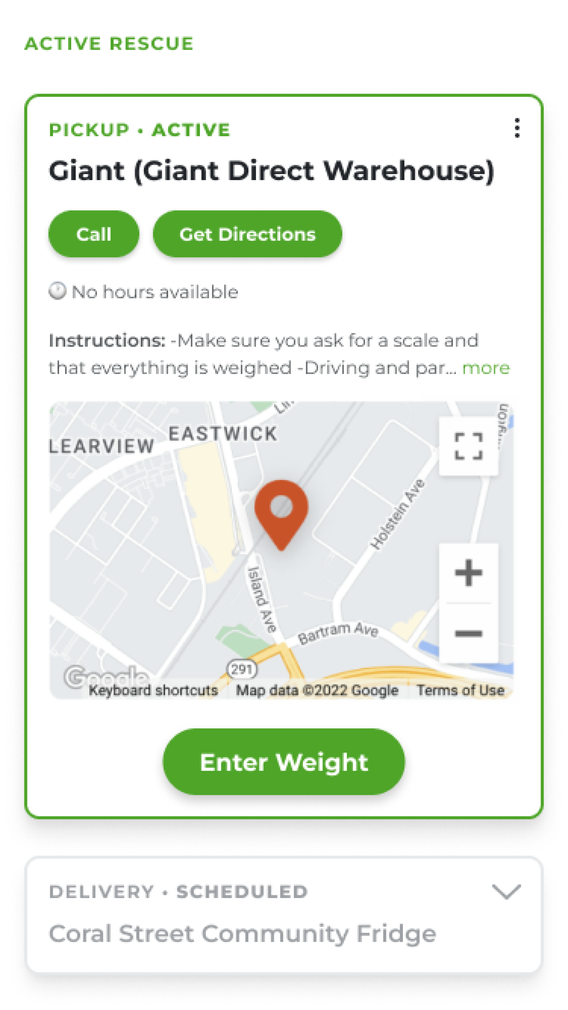
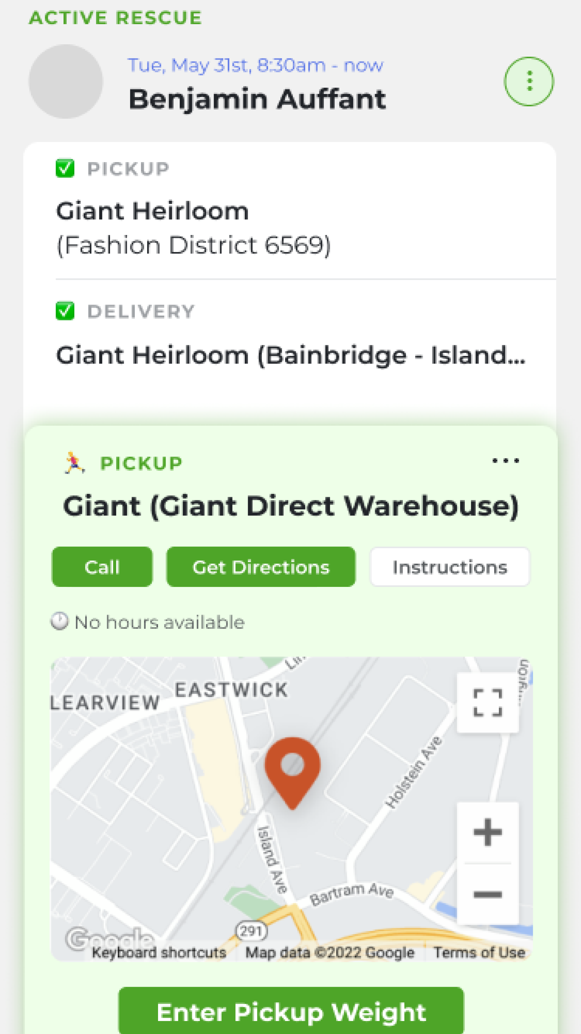
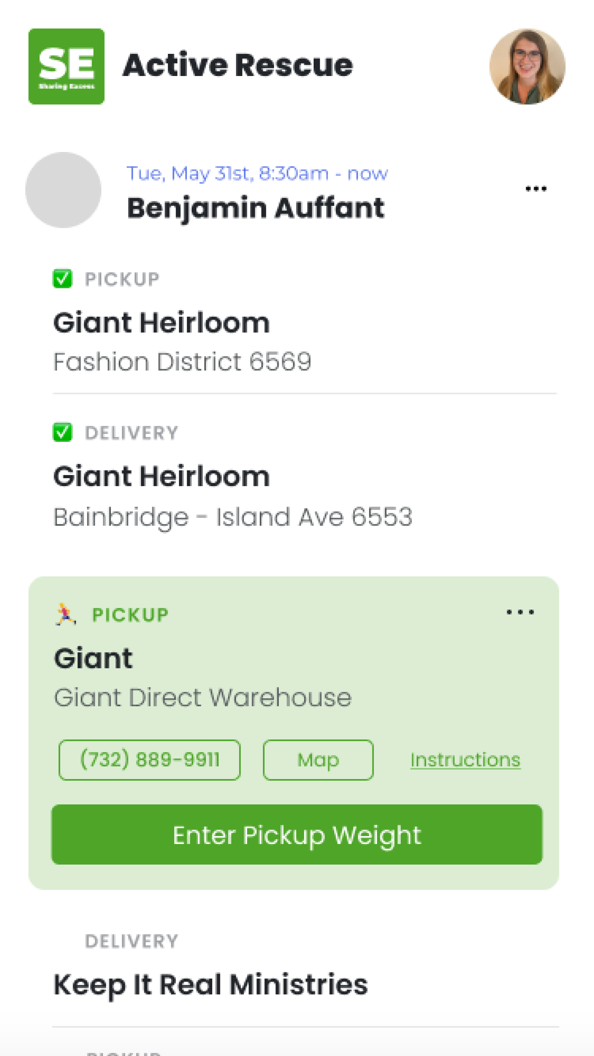
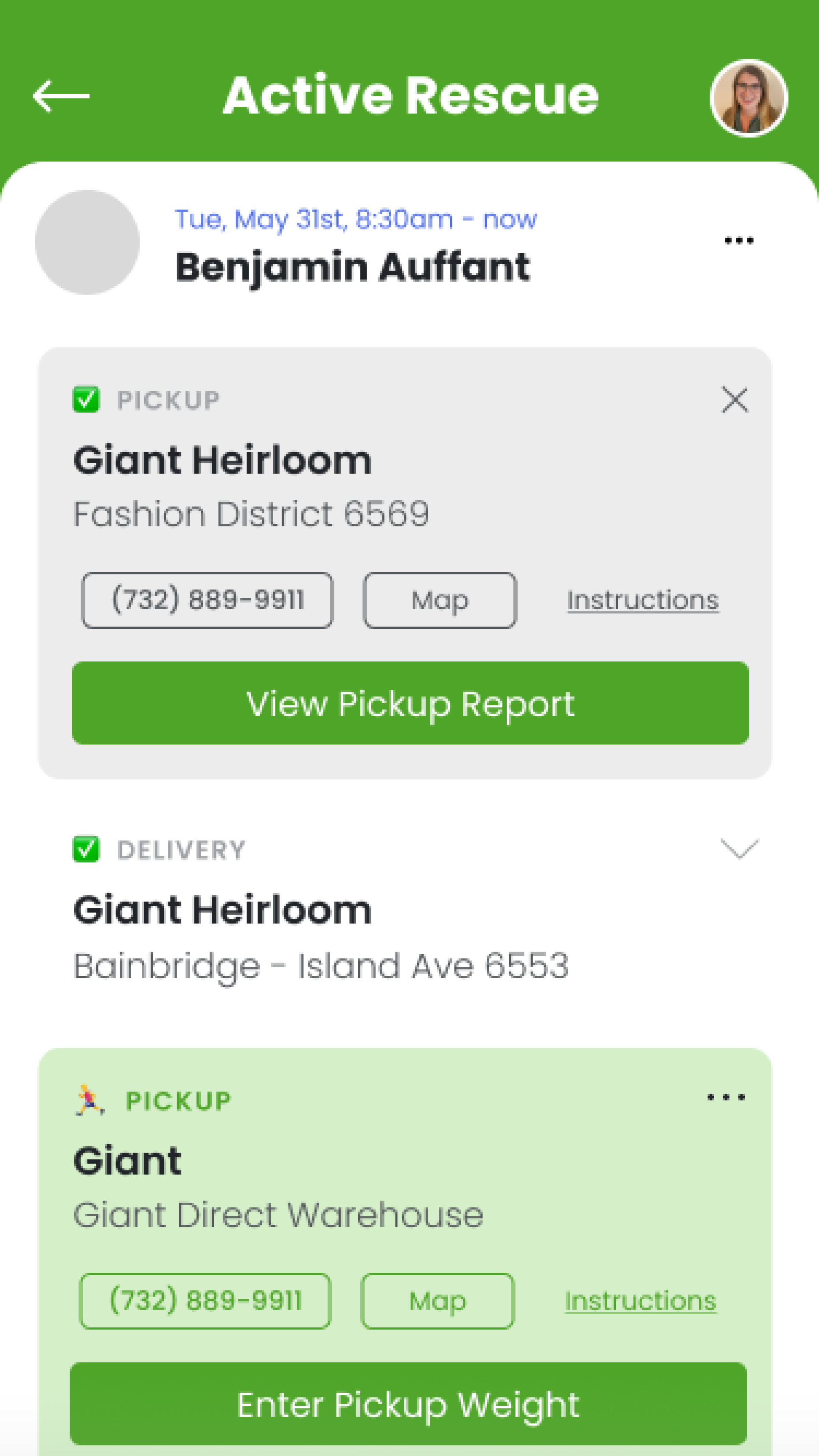
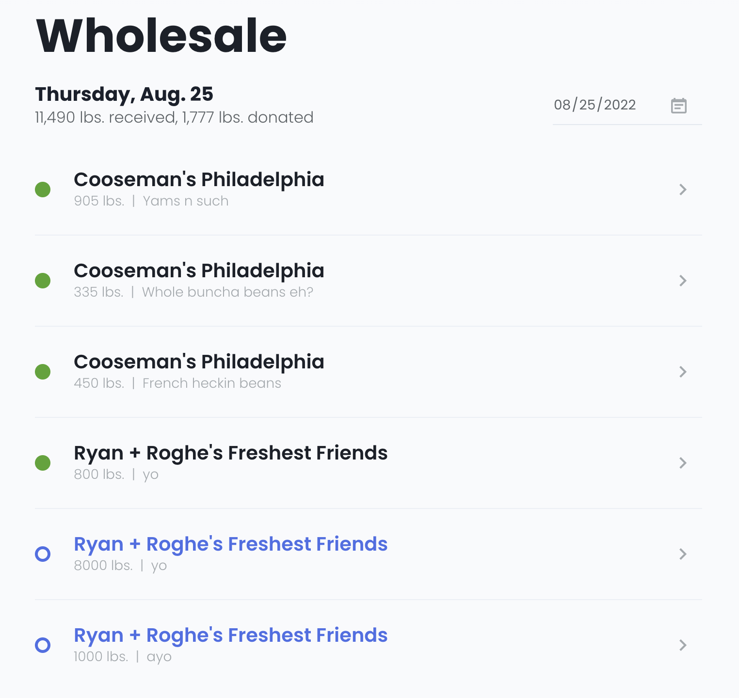
The Sharing Excess Food Rescue App is a web-based app used to rescue and deliver surplus food.
Rescue drivers and wholesale employees use the app to document data about how many pounds of food were rescued and track pickup and delivery routes.
Pain points included:
- Cluttered interface, with too much information on cards
- Tedious data entry for wholesale employees
- Color pairings with brand green required excessive drop shadows and had poor contrast

Old interface (first) and new interface (second).
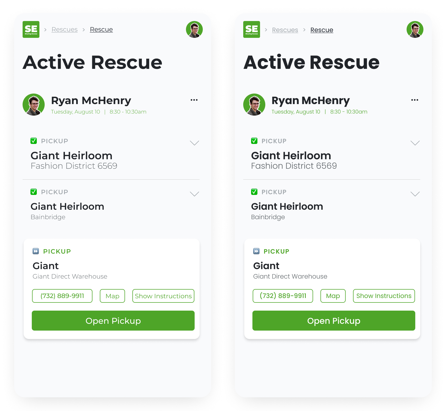
I first started by making wireframes of the cards, focusing on ways to increase visual hierarchy and hide information behind buttons. This way, drivers could still access everything they needed through actions.
Pictured below are some of my preliminary wireframes.
Here, I experimented with different ways to incorporate the brand colors, improve visual hierarchy, and create information chunking. Some key design choices that stayed in the final design included:
- Relegating the location nickname to a secondary line with a lighter font weight
- Choosing square instead of rounded buttons to modernize the interface and removing the drop shadow
- Using the map button instead of displaying the full address
ux flows
After talking to wholesale workers and watching their task flow to enter data, we decided to add a separate wholesale user flow for the first time. The original app had wholesale workers enter data in a workaround way, and it was finally time to roll out a real solution.
We collaborated with the user group throughout the design process, sharing wireframes and ideas with them. After deployment, we kept the lines of communication open to receive continual feedback on what works and what doesn't work.
Additionally, I refined the onboarding flow to take users into the app as fast as possible. I added illustrations and focused on visual hierarchy to create a positive first impression and fulfill the aesthetic-usability effect.
introducing dark mode
To make the app more flexible, we introduced dark mode to accommodate user preferences. For this feature addition, I designed a dark mode color palette that maintains high contrast and color hierarchy. I chose blue-toned grey colors, making the color palette more lively.

Dark mode was prioritized because it reduces eye strain, making it a safety and accessibility priority. Especially for users using the app on the road during early and late hours, this feature was essential for usability and comfort.
design system elevation
Beyond adding a dark mode color scheme, I led a deeper expansion of the design system. I introduced six shades of red, yellow, and blue, naming the colors with a scale of 100-600 for easier identification. Then, I mapped those colors to names that remained constant across light and dark modes, such as "surface-background" and "element-primary." I referenced material design guidelines for naming techniques. This way, programmers can reference a variable that is descriptive of its purpose, abstracted from the color itself.
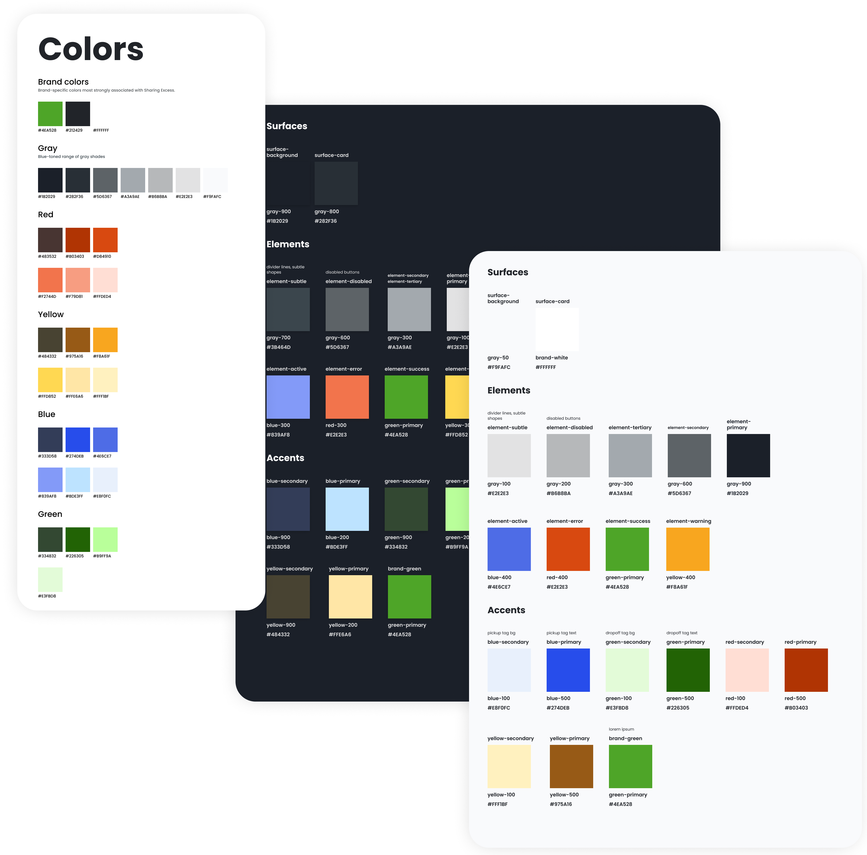
Next, I componentized elements such as buttons, inputs, typography, shadows, and tags, applying variants where necessary. To make handoff smooth and add clarity to the components, I showed example applications of how to use the components and colors.
welcome, poppins!
Another change I initiated in the Sharing Excess design system was the transition from using Montserrat to using Poppins as the primary (and only) font. Though great for presentations and display text, I discovered that Montserrat was not suited for body text. The lighter-weight fonts were also difficult to read at smaller sizes, and the heavier-weight fonts took up too much space. During the initial wireframing, I struggled with how wide the letterforms looked with Montserrat. When I tried using Poppins, the minimal, clean look I aspired to achieve seemed closer than before.
To compare the two typefaces, I put the same wireframe side-by-side, with the only difference being the font. After showing this comparison to the Executive Director, he agreed that Poppins looked better and decided the transition was worthwhile.
montserrat (left) and poppins (right)
the future of food rescue app
Thanks to this design sprint, software changes have been easy for the developers to implement. Having implementable components and the design system as a guide allows us to focus on the user without getting bogged down by design uncertainties.
In the future, this design system can be modified, built upon, and integrated however necessary. The design system is flexible enough to support this dynamic startup's needs. Above all, a positive user experience encourages the user to return to the app and accomplish the most important goal: to fight food insecurity.