Podcast But Outside
10 weeks desktop + 10 weeks mobile & tablet | 2021
This prototype is interactive, and it's a lot of fun to explore! View live Figma prototype here: desktop, tablet, mobile.
Podcast But Outside (PBO) is a comedy podcast hosted by Cole Hersch and Andrew Michaan, combining a man-on-the-street interview style with deadpan humor. Both hosts have backgrounds in comedy writing, standup, and social media fame.
My website redesign embraces the offbeat quirkiness of the podcast’s brand, welcoming the audience with hand-drawn elements and playful themes.
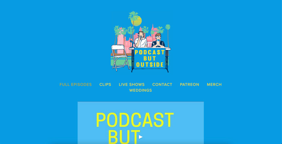
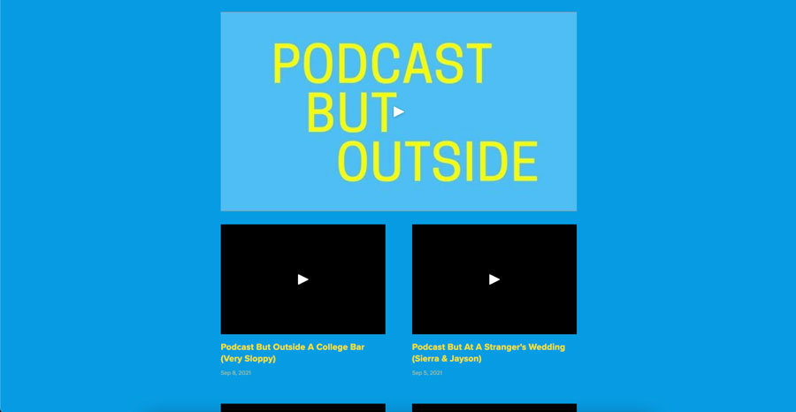
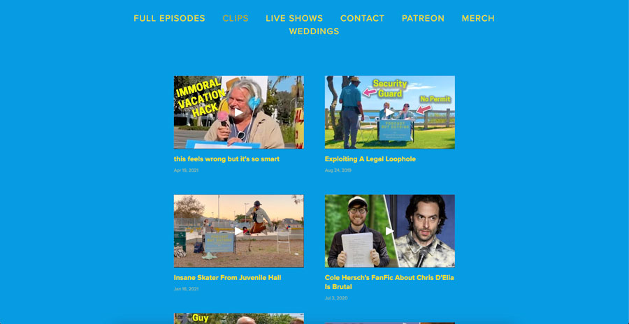
starting point: Original Website
After viewing the original website, I noted some of the pain points that I observed. These included:
- Poor color contrast and poor text legibility
- No pagination or filter on video gallery, creating an endless scroll
- The website has no home page, so the user does not get an overview of the site or impression of the podcast's personality
One benefit of the existing site is its simplicity. Text is kept to a minimum, and there’s no visual mess competing for attention on the screen. In my redesign, I wanted to keep this simplicity but add more on-brand humor to the site’s interface. My challenge was maintaining a balance of efficiency and delightful design. Too much focus on efficiency would detract from the design, and too much focus on design would distract the user from navigating the site.
creating a proto-persona
During this project, one limitation was that I did not interview the actual user base of the existing website. Since I did not have that data, I created a proto-persona based of my assumptions of the Podcast But Outside’s target demographic. The profile is based on an overview of fans who interact with the podcast on social media and commenters from the YouTube videos.

I noted the importance of social media marketing as a way of updating fans and showing the hosts' personalities. Therefore, the visibility of social media icons on the website became a priority in the redesign. Additionally, most fans seemed to be either millennials or part of Gen Z, so these digital natives expect websites to be engaging and upfront with content.
hand-drawn & down to earth
When I was considering how to show the personality of the podcast, my brainstorming started out broad. I asked myself: what kind of shapes will I use? What visuals does the Podcast But Outside use on social media? How do the podcasters want to be seen? And I searched for the answers by watching podcast episodes on YouTube and digging into their social media presences.
Through this inquiry, I found that the podcast uses illustrations with black lineart and bright colors. I also considered the low-budget production value and how to embrace it in my design. Most prominently, the podcast hosts use a folding table and a paper sign when they conduct interviews. This is what inspired the collaged cut-out design shown in the prototype. Below, I've included an example of a social media graphic and the podcast's setup.
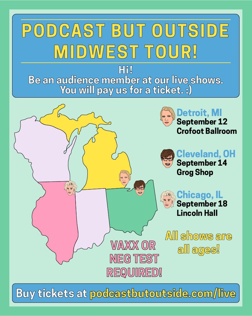
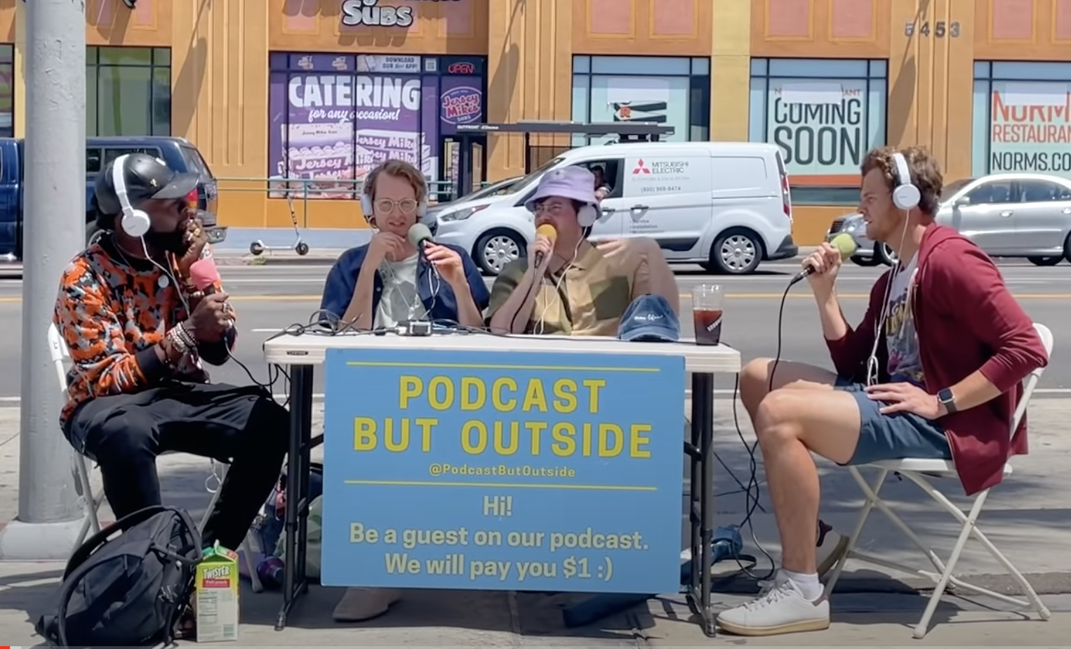
Photos courtesy of Podcast But Outside
As I began to create the components necessary for the prototype, I drew out the elements on paper and converted them to vector images on Illustrator. This achieved the hand-drawn, one-of-a-kind look that matched the podcast's existing branding.
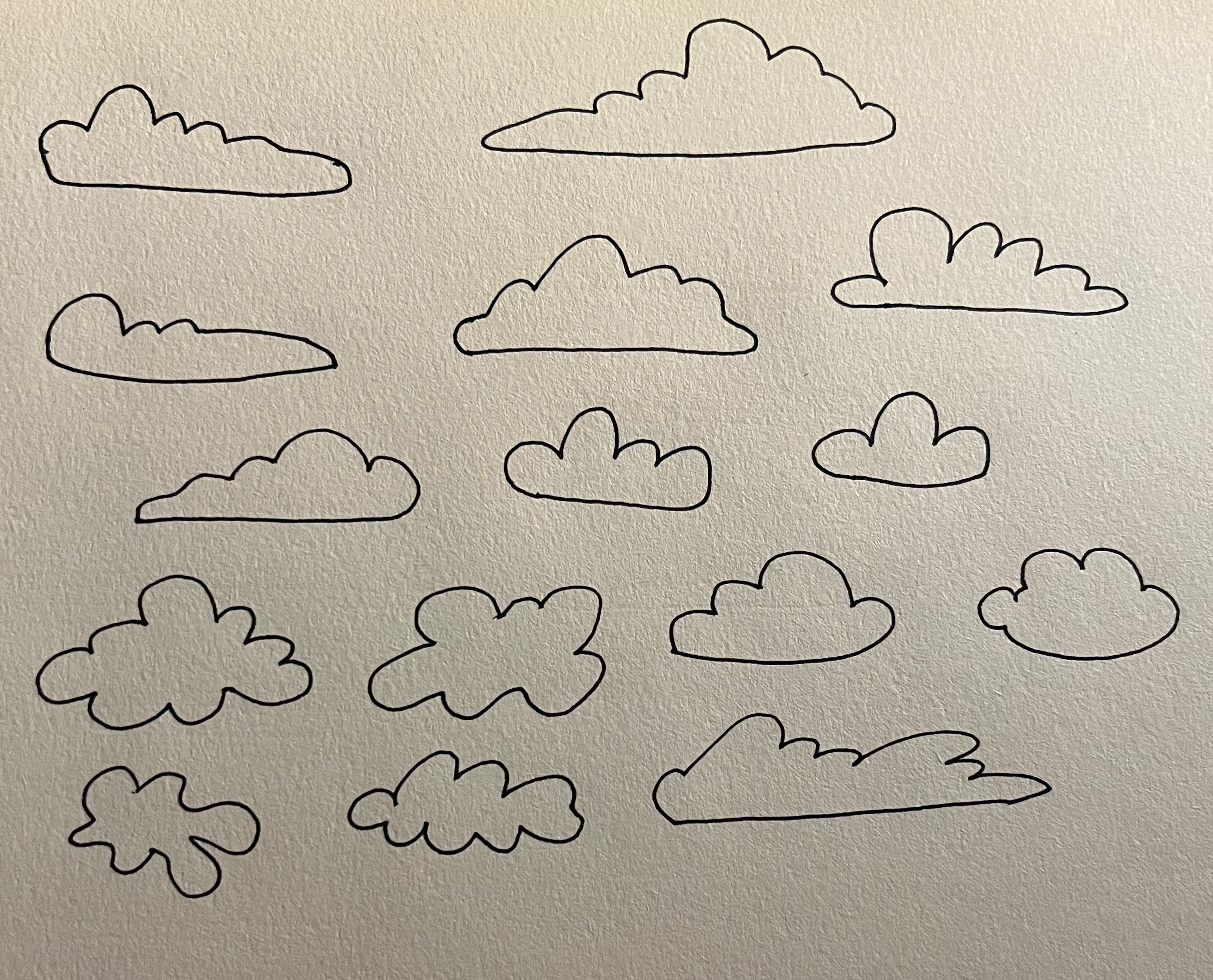


illustrated cloud elements
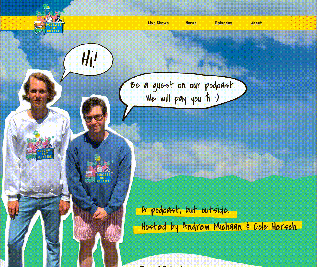
page 01: home
design
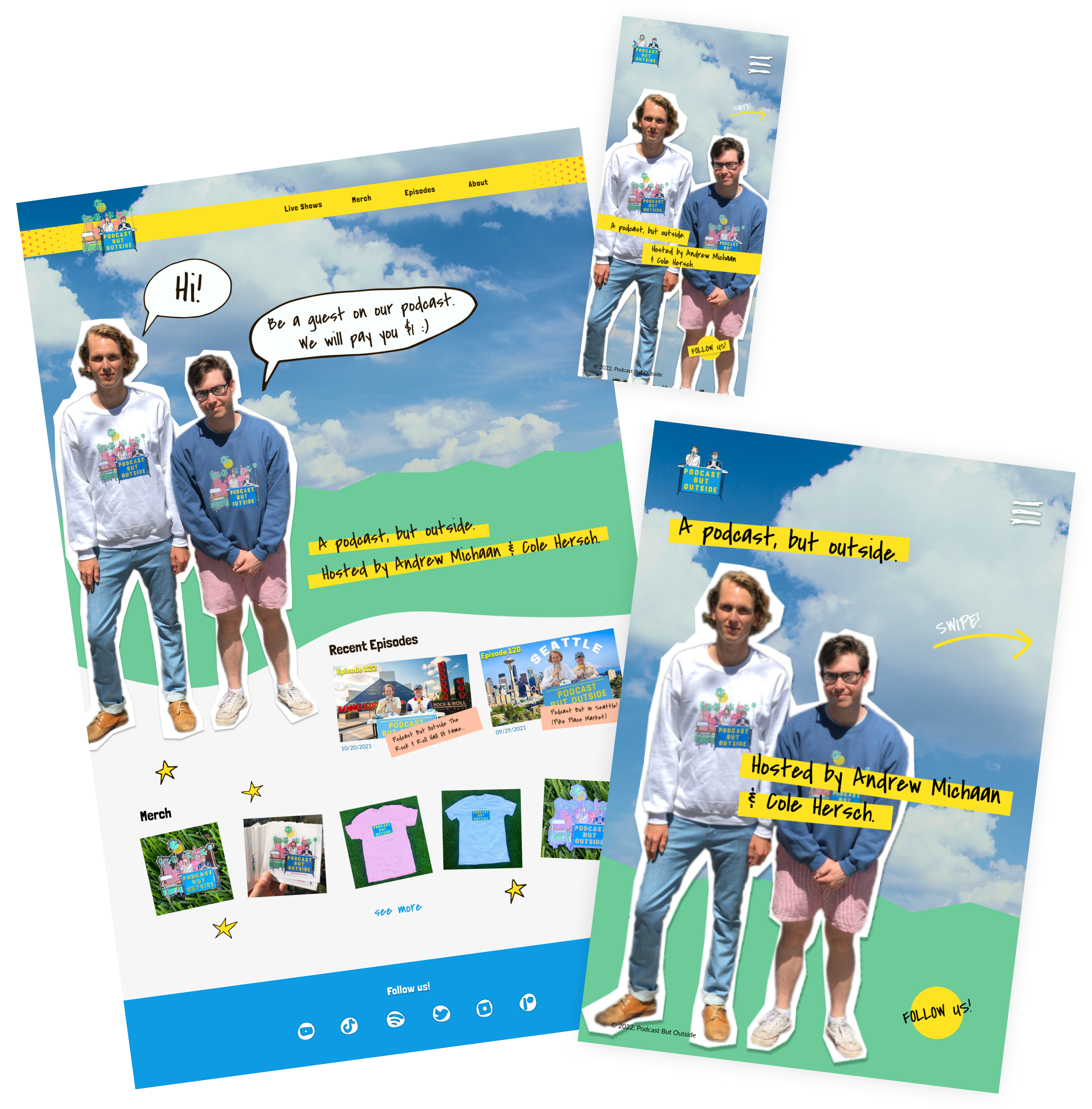
For the home page, I wanted to visually represent the “outside” element of the podcast with the hosts standing in front of an outdoor background. After experimenting with a few ideas, I added the cloud background and realized that it had the most potential. From this starting point, I added a green graphic to represent grass, and created a cut-out image of the hosts to place on top. I also included cloud graphics in the navigation bar to further integrate the cloud imagery.
At the mobile breakpoint, I removed the grass to simplify the design. Additionally, the mobile home page does not scroll and instead prompts the user to swipe into the interior pages. All the changes on smaller breakpoints were influenced by legibility and simplicity.
interaction
The first animation the user sees on the website is the slow cloud movement. This is consistent across all breakpoints and adds a touch of realism and interest to the design.
On desktop, the pictures in the Merch category slightly rotate on hover. I made this choice to encourage interaction with products and add personality to the page.
navigation menu
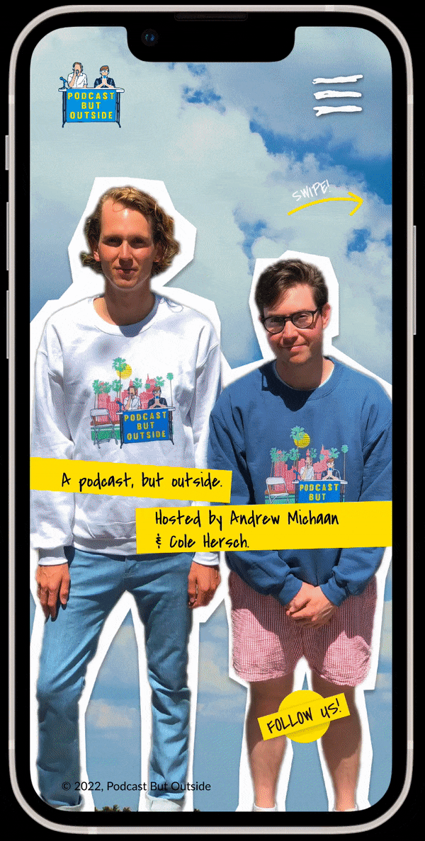
The navigation menu echoes visual branding elements from other parts of the website. On mobile, the menu features colored rectangles and stars. On desktop, the menu features drawn clouds.
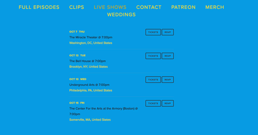
page 02: live shows
design
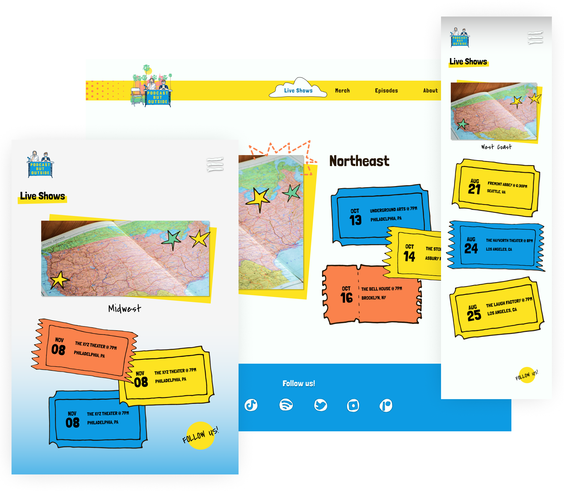
The live shows page lists upcoming tour dates and links fans to a ticket purchasing site. Instead of a traditional list view, I used graphic representations of tickets with the information listed on each ticket. Tour dates are organized by region, since buyers are looking for venues closest to them.
interaction
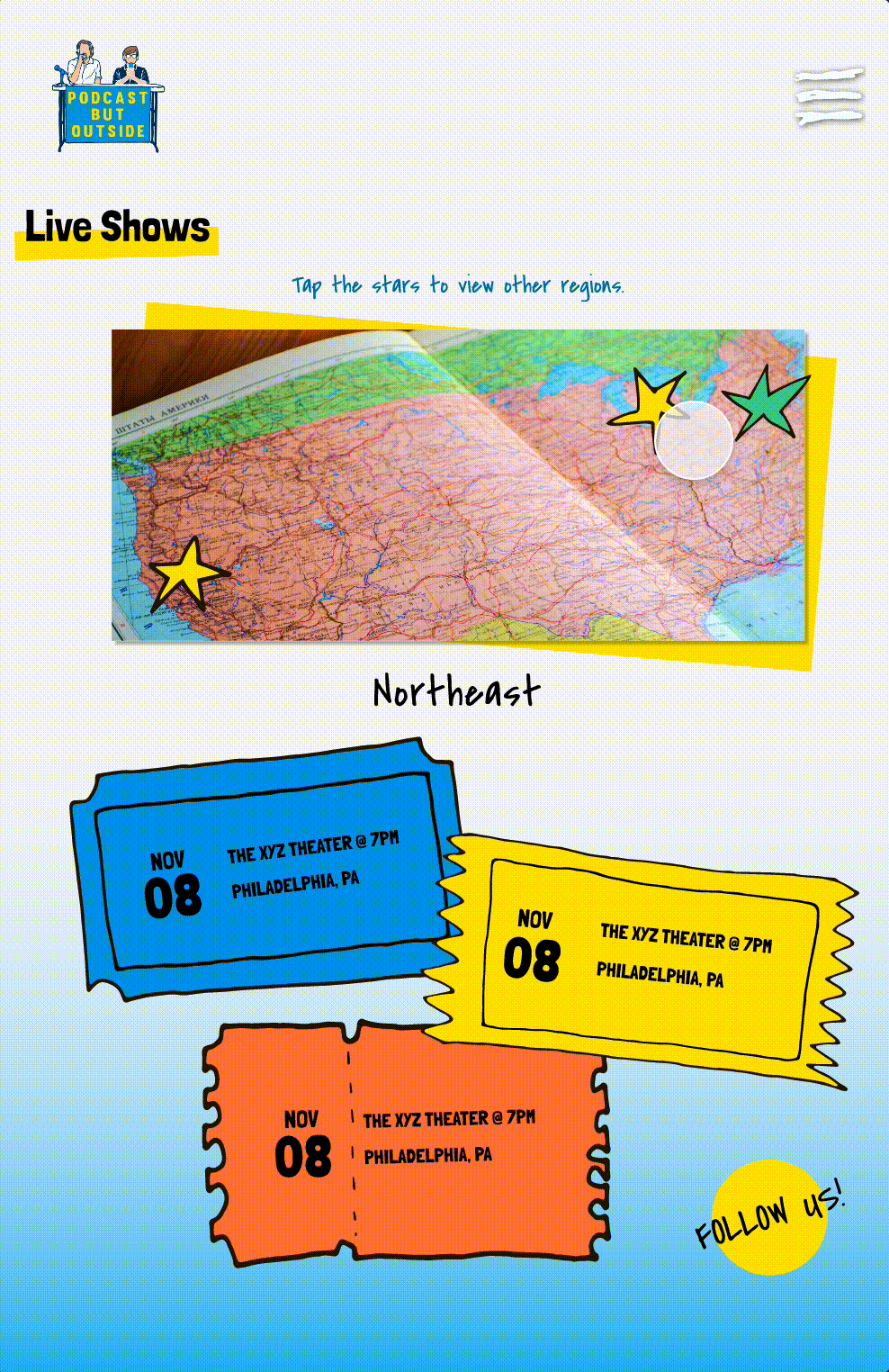
The user navigates the page by tapping stars to view regions. The tickets change accordingly, displaying related tour dates and information.
You may have noticed that the tablet breakpoint features a blue gradient at the bottom of the screen. When I made the tablet layout, the page had a sense of emptiness. The desktop footer gives the breakpoint a sense of finality, and the small screen size of mobile benefits from minimalism. However, I still felt like the tablet needed more. I thought about how the user holds a tablet, with the bottom of the screen closer to them, and I realized this was an opportunity to add depth. So, I added the gradient to add dimension to the screen.
page 03: episodes
design
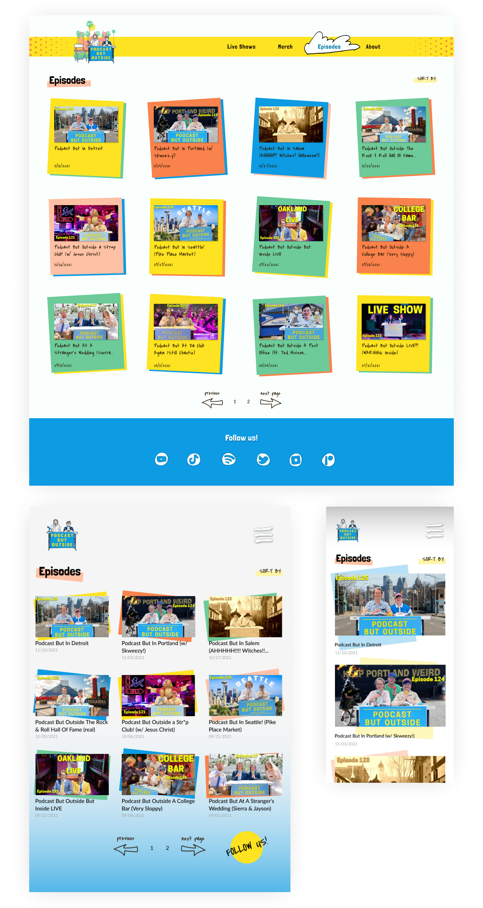
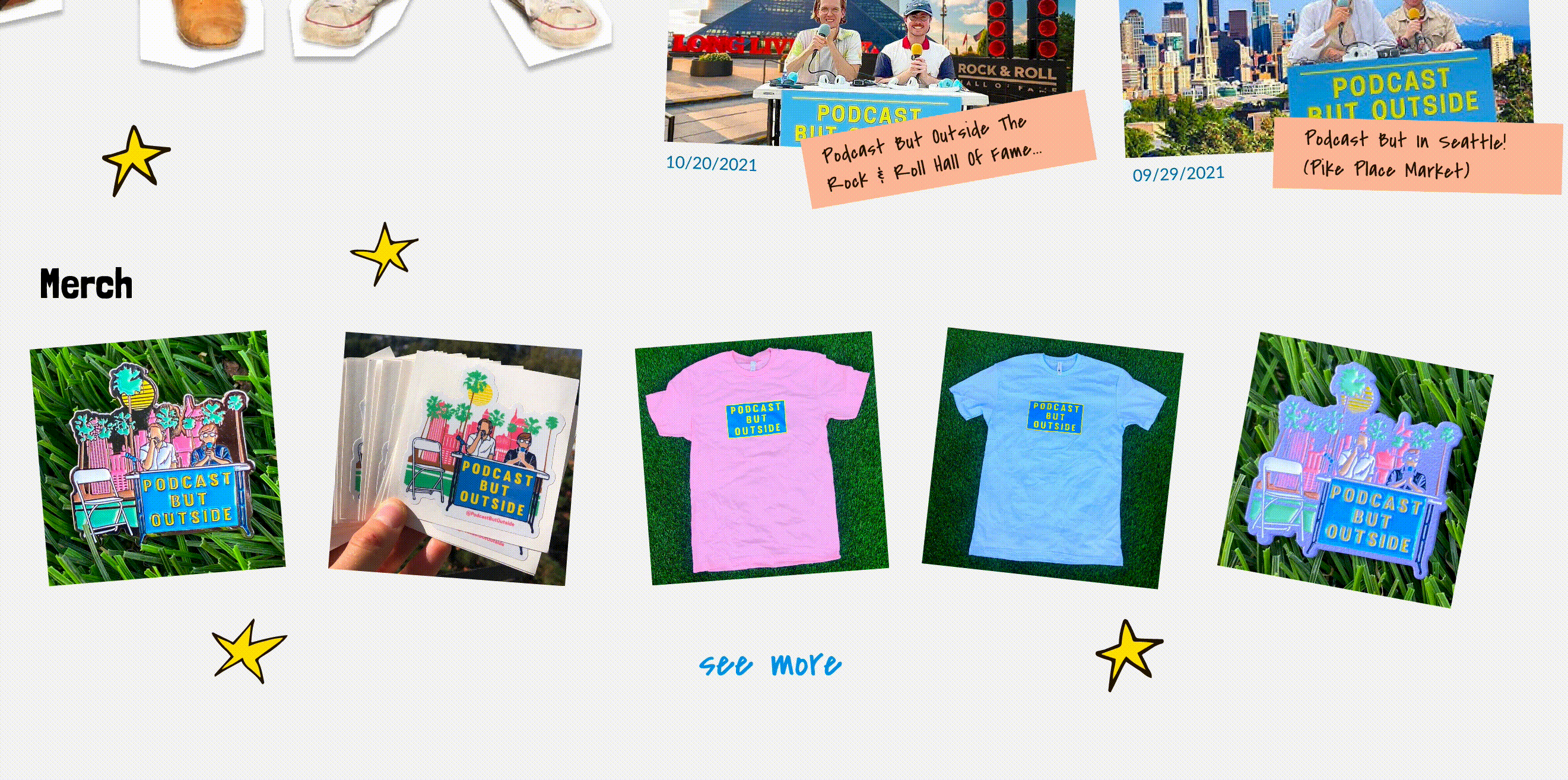
For the episodes page, each thumbnail has a unique twist, adding interest to the grid layout. Although each breakpoint has a slightly different design, the skewed color blocks remain consistent.
To combat endless scrolling and create structure, the page has pagination on desktop and tablet. On mobile, the natural movement is to scroll down, so the pagination is replaced with a "load more" button. All breakpoints have a "sort by" feature to improve navigation.
interaction
The desktop hover interaction implies clickability, and the other interactions are minimal to enforce focus on the content itself. On mobile, a "back to top" button appears on scroll.
Final Result
In my redesign of the Podcast But Outside website, I aimed to strengthen the brand voice with engaging graphics and playful design choices.
Since this was a personal project, I experimented with creative solutions. Due to the limited resources of this project, I assumed the user pain-points and goals. If this project was for a real client, I would interview the existing user base and talk to the client about their branding and marketing goals. The design would be rooted in contextual inquiry and the core mission of the Podcast But Outside.