A reworking of Sharing Excess' About page, plus the addition of three new subpages.
I worked closely with the executive team to develop a solution that expressed the core of Sharing Excess: a team of change-makers who believe food should be shared, not wasted.
As a designer who codes, I led the project from concept to deployment.
data-driven decisions
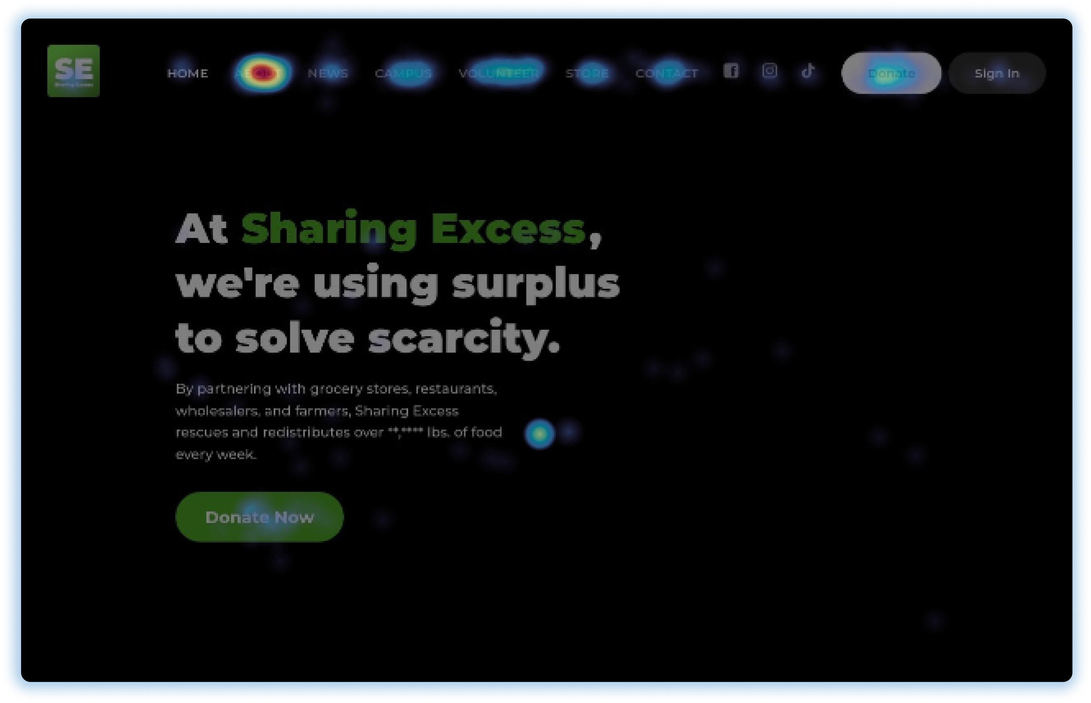
According to Heatmaps, the "About" tab is the most clicked element on the home page of sharingexcess.com.
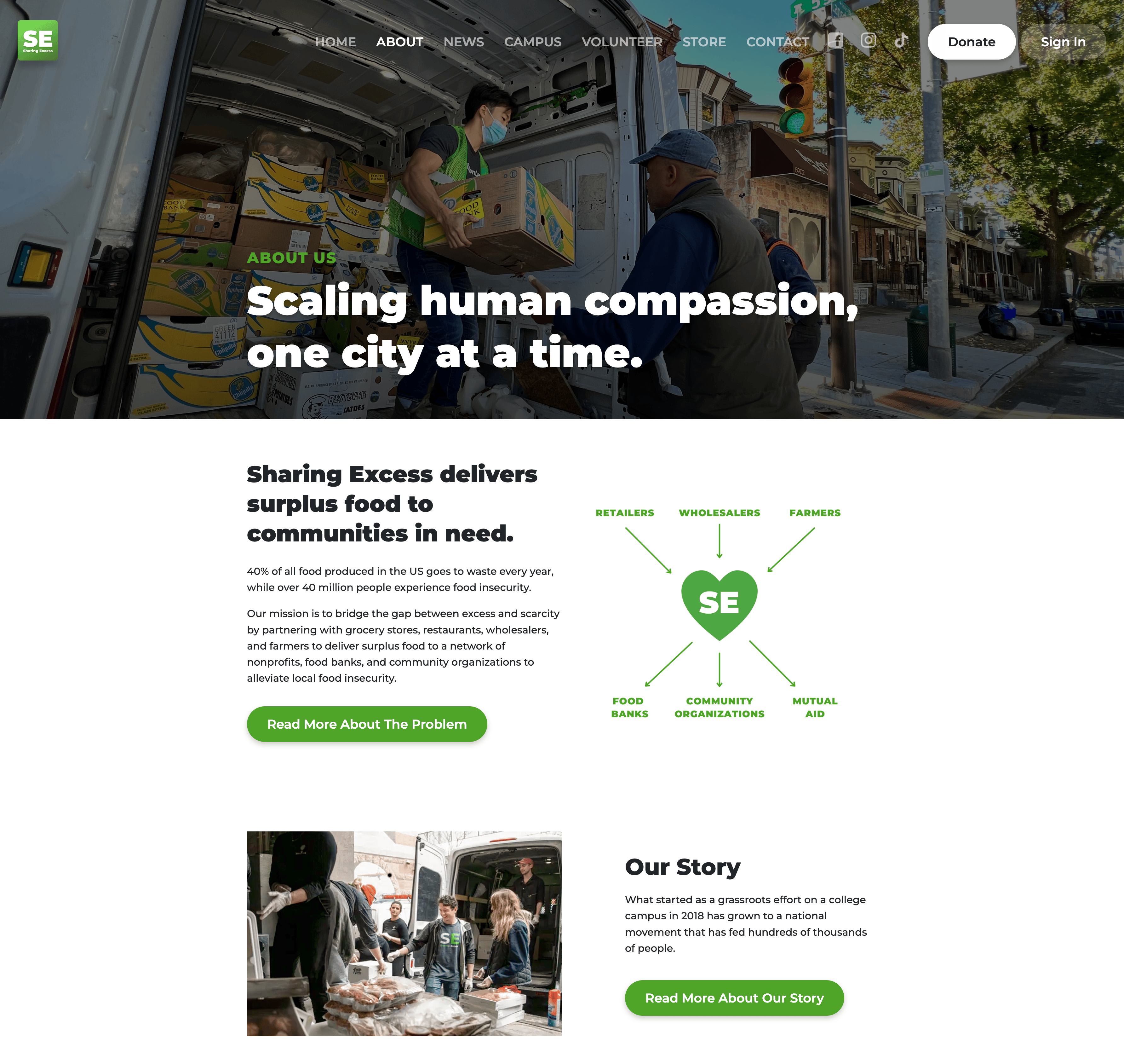
Considering its importance, the executive team prioritized updating this page with relevant information, sectioned into easily readable and navigable pieces.
channeling the brand voice
What could represent something approachable and generous, flexible and constantly adapting? A soft, organic wave. Sharing Excess uses the wave shape more than any other shape in their visual identity. Because of this, I incorporated this shape into the website.
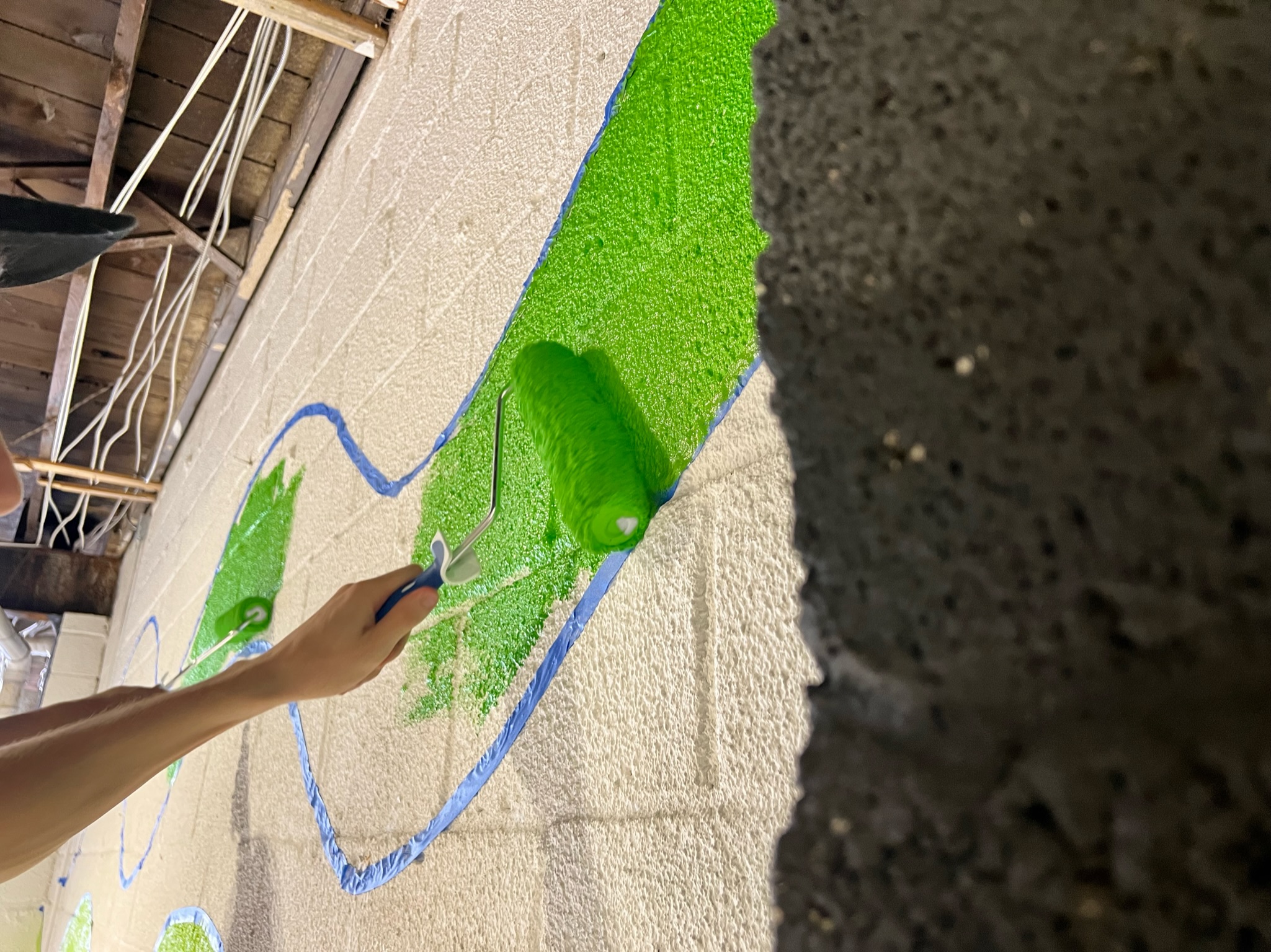
Waves being painted in the sharing excess warehouse
Instead of ordinary color-block sections, I introduced the wave background to the About page. Some original designs included a secondary yellow color, but after some iterations we realized that it was best to keep the color palette simple.
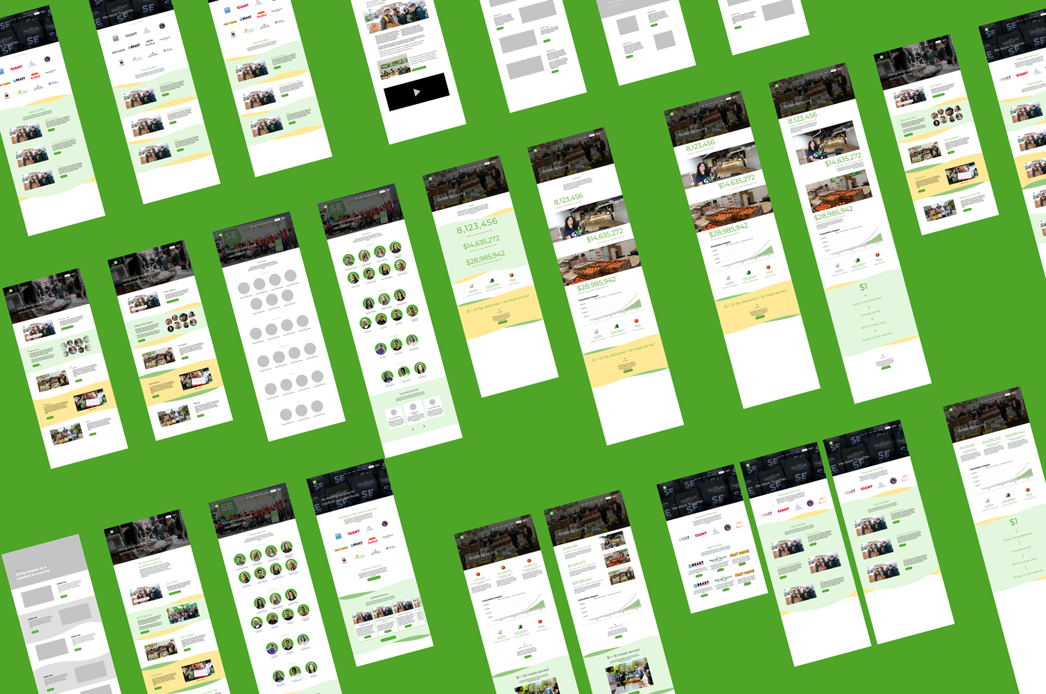
This update was the first introduction of subpages to the website. Therefore, the finalized wireframes created a legacy for the future. The designs had to be scalable and elegantly simple, ready to adapt to growth as it comes.
go forth and write code!
After completing the wireframes and getting the green light to continue, it was time to code.
At the time, I was unfamiliar with Next.js and React.js. On top of that, the website was written in TypeScript, which I had never worked with. Luckily, my knowledge of Java made it easy to pick up TypeScript. I learned more about the other development tools with help from my team lead and online resources, and soon I brought my wireframes to life.
next up: design system work
After completing this project, I earned the Executive Director's trust with Sharing Excess' design system and visual identity. The process of copywriting, documenting content and learning about information architecture inspired the organization's leadership to think critically about digital strategy. This opened the door for a redesign of the internal app, creating design system standards, and started conversations about future website improvements.
What started as a webpage modification blossomed into something so much more: an ongoing pursuit of a meaningful and unforgettable digital identity.
To read the related case study, click here.